Client: Personal project
Role: Mobile + Web Design
Type: Marketplace, Platform

Technology has altered the way we communicate. More and more millennials are starting to collect. Whereas young people rather collect what they love, the more traditional collectors focus on art as an investment and are searching for value. This seems to create a gap between primary and secondary markets, making it less accessible for a younger audience, while the younger collectors are also searching for belonging.

For this art platform and marketplace, I designed an intuitive onboarding and sign-up flow to ensure a seamless entry point for new users. By streamlining the registration process and guiding users through clear, visually engaging steps, I aimed to reduce friction and encourage quick adoption and fast discovery into the artworks and categories.
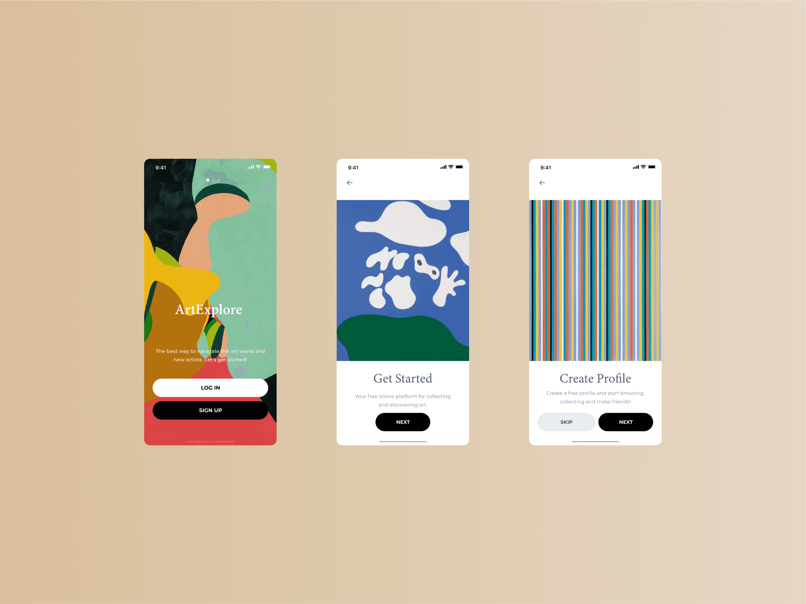

Before designing a high-fidelity prototype, a visual mood board was created for inspiration and to set the feel and direction of the app. I focused on finding different elements (colors, typography, and imagery). Because the art itself is quite colorful at times. To balance that I decided to keep the UI clean, functional and minimal e.g. black and white tones that will go well with the colorful artworks.


Users can explore a wide range of categories such as painting, drawing, digital art, photography, and more. The app’s interface can present these categories in visually engaging ways-through grids, carousels, or search functionality combined with personalized recommendations, ensures users can easily navigate through curated collections.


Users are encouraged to create expressive, customizable profiles that highlight their artistic identity. By implementing intuitive search, users can effortlessly connect with fellow art lovers, while smart recommendation algorithms suggest relevant creators and friends based on shared interests and engagement.
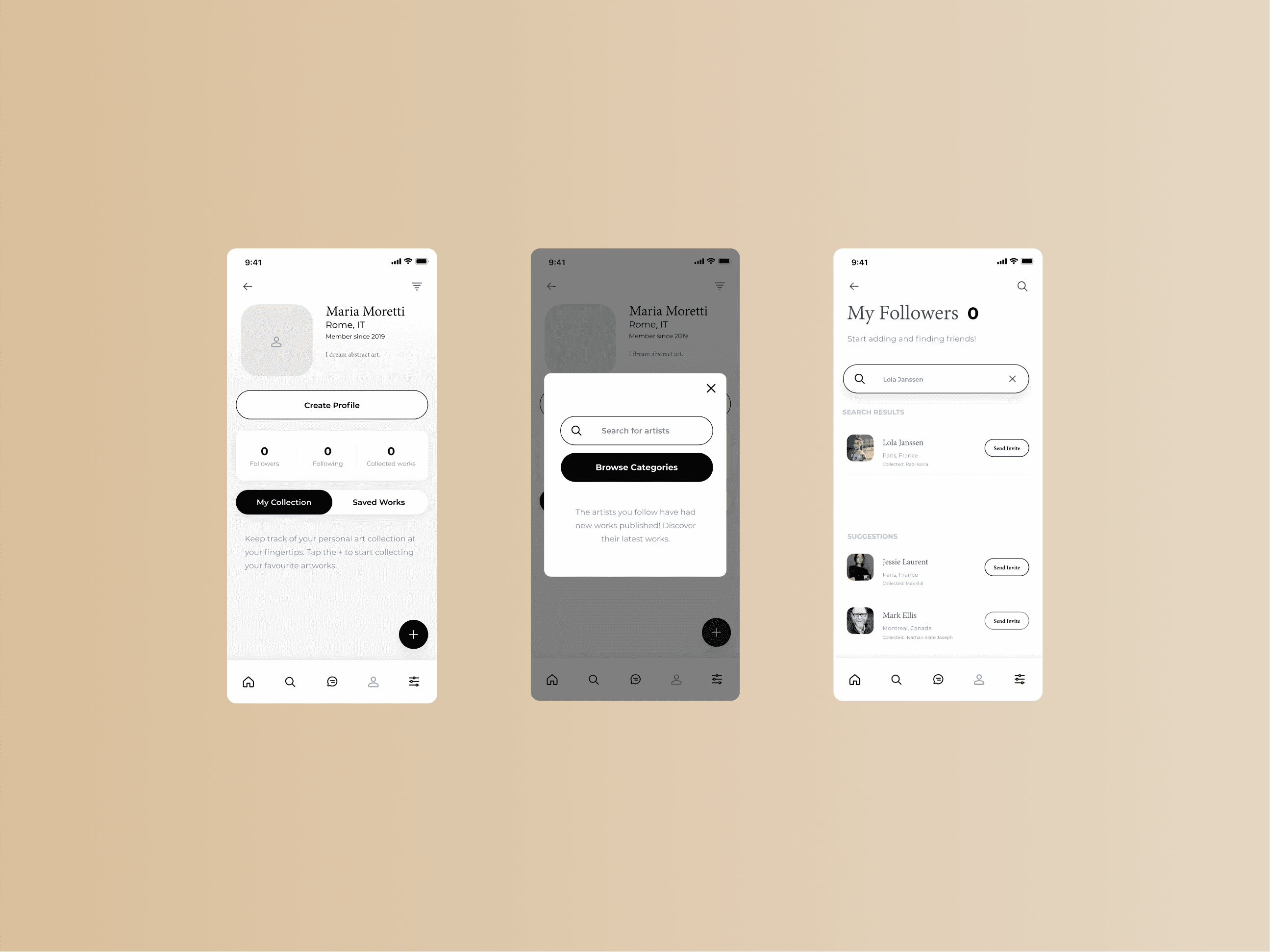


Users can easily message each other, browse their followers list, and open direct chats to discuss collections, share artwork, ask for opinions, or send recommendations while making it easier to build relationships, exchange ideas, and deepen connections within the art community.


With the ability to set and share their location, users can see where their friends are exploring and connect with them in real time. The global search feature makes it easy to find both nearby and international galleries, fostering discovery and community engagement wherever you go.

For the marketplace website, intuitive browsing is central to the user experience. The platform is designed to make it effortless for users to explore a wide range of artworks, discover new artists, and find pieces that resonate with their tastes by prioritizing clear navigation, visually engaging layouts, and playful search filters.