Sleep, Science, and Wellbeing: lllustration for Philips Sleep
Sleep, Science, and Wellbeing: lllustration for Philips Sleep
Sleep, Science, and Wellbeing: lllustration for Philips Sleep
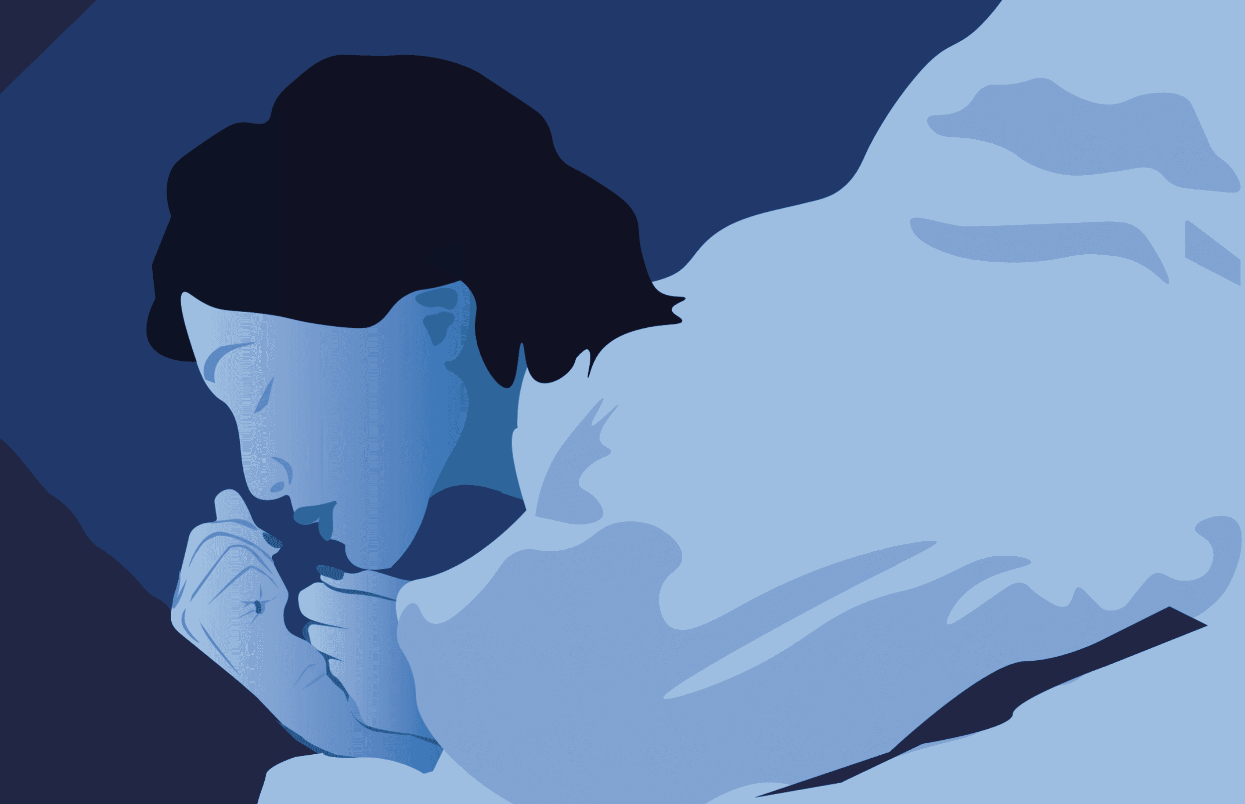
When I set out to create an illustration for a campaign commissioned by Philips Sleep, I wanted to capture not just the act of sleeping, but the feeling of serenity, science, and self-care that surrounds it.
Calm meets Innovation
From the beginning, I knew this piece needed to evoke stillness and calm, while nodding to the Philips brand using its blue signature color which signifies health. I sketched a solitary figure; peaceful, cocooned in comfort, immersed in a palette of cool blues that mirrored both nighttime tranquility and clinical precision.
A woman asleep, nestled softly against a pillow. She’s calm, safe, and undisturbed—a visual metaphor for what Philips aims to provide through its innovations in sleep care.
The process
To bring this vision to life, I turned to Adobe Illustrator. Here’s how the process unfolded:
1. Sketching the Form
I began with a simple hand-drawn sketch, outlining the contours of the sleeping figure. This stage was all about gesture and emotion while capturing the posture and mood of someone truly at rest.
2. Building with Vector Shapes
Using the Pen Tool, I recreated the sketch with clean vector paths. Each section—the face, hair, hands, blanket—was drawn as separate shapes. This allowed for flexibility in color gradients and layering.
3. Playing with Color
Color is essential when evoking mood. I opted for deep navy and gradient blues, creating a layered, nighttime feel. The use of tonal contrast helped define the figure without the need for hard outlines, giving it that softer, dreamlike aesthetic.
4. Emphasizing Light and Shadow
Instead of using photographic realism, I relied on vector-based shadows—subtle overlaps and color shifts—to create depth.
In a world overwhelmed by data, I aim to bring back the human side and bring that back to the science behind Philips’ mission. It was a delightful project to do for Philips Healthcare!