Exploring a more efficient way to for customers to leave feedback.
Role: Senior Designer
Team: Key stakeholders (AdTech, Customer Support, Data, Sales)
Length: ± 1.5 months
WeTransfer streamlines the workflow process for millions of creative professionals. Next to that they have an advertising platform of which 30% of its advertising space to support artists and social causes. These advertisements are visible to free users.
WeTransfer’s large advertising space provides a way for advertisers to reach their audiences online in a format that is more effective and more coherent with their brand image.

The problem
In most instances we are able to prevent poor UX on the basis of our design principles, guidelines and tracking of behavioural and MOAT metrics. But as we created more immersive ad experiences we felt it could:
a) negatively affect UX (recent complaints from users on motion/movement on wallpapers)
b) skew KPIs and behavioural metrics (multiple clicks before click through)
This led us to investigate into how users feel about the ads and collect a large scale sample on how users experienced a specific ad or campaign. So far there was little data available around brand perception and user sentiment. We didn’t track user sentiment specifically regarding ads. CTR and quantitative data is not sufficient enough to pinpoint user attitudes. It’s important to look at how we can convert free users (who see the ads) into pro users and find out what makes them pivot and gain deeper understanding on why free users churn, or not convert.
87M
monthly active users
500K+
spend by verticals
per quarter
The opportunity
WeTransfer has relationships with many renowned brands who spend heavily on advertising.
Introducing attitudinal metrics
WeTransfer is uniquely positioned to serve these advertisers with best-in-class digital ad solutions and interactive experiences. We saw an opportunity to provide more value to these clients by improving the way users could leave feedback on our platform regarding the advertisements.
We realised it was important to learn more about the free user, how they feel about the ads. By learning more about the sentiment, we could optimise the user experience thus improving ROI for out clients in return by knowing what works and what doesn’t.
Using a holistic approach to understanding customer sentiment.
Once we know what’s driving customer sentiment, we can test hypotheses about how we can improve it. Then, we can attribute our actions to the business outcomes and at the same time improve the user experience.
Using a feedback tool means we can surface several sentiment unfolding in context, quantify the impact, and set goals to improve sentiment thus increasing value for both clients and users.
To understand the full picture its important to capture;
Solicited feedback; Customer attitudes — Customer Satisfaction (“CSAT”), Net Promoter Score (“NPS”), Customer Effort Score (“CES”).
Behavioural feedback; Customer behavior — engagement activity, etc.
Organic feedback; Feedback that is already available based on issues customers were self-motivated to express.
The process
Sitting with customer support to learn about the feedback and submitted tickets, additional user interviews.
Stakeholder interviews to gain more insight into data, analytics, pain points and solutions that had been tried before, and how they were or why they weren’t implemented.
Affinity diagramming
Kick-off
Workshops (Problem-framing, HMW, Userflows)
Ideation & refinement phase
Handoff + development
My role
I initiated this project together with the PM. In addition, I worked alongside 2 Customer Support Specialist, 2 Data analysts, 1 Engineering Manager, 1 Product Manager and 1 Sales Director. I handed over this project before implementation phase.
The goal & approach
Introducing a rating system + sending out surveys to measure brand perception CES, and CSAT.
By simplifying the process to leave feedback we could increase the chance to potentially discover accessibility issues, eliminate guesswork, learn more about users attitudes and brand preferences, improve CSAT, but also optimise our wallpapers which was a win-win for users, the business and our clients (advertisers.) In this team it was always the challenge to balance those needs.
1. CSAT survey & general email survey
Next to measuring immediate feedback we also planned to set up a more general survey to learn more about user’s opinions around the brands WeTransfer collaborates with. This way we can measure users direct response on the ads per vertical while it is fresh in their minds and at the same time gain a broader understanding of how users experienced our content and learn about brand preferences.
2. Improving the current feedback flow.
We saw an opportunity in optimising the current feedback flow first before so we could already collect data on sentiment more efficiently.
Business outcomes & needs
Less churn
Higher customer loyalty
Improved brand perception
More insight into brand preferences per vertical
More data on campaigns to maximise performance
Increased customer satisfaction
More ROI for clients
The research
Analysing organic feedback to discover pain points and divide into buckets and categories.
First I started with some research and analysis as important to uncover the pain points of our users and see what feedback already came in via submitted tickets and via a few remote interviews.
Methods and approach:
1. Talked to customer support
2. Stakeholder interviews with Sales, Data & AdTech
3. Analysing customer support tickets
4. Affinity mapping exercise
5. Audit & UX review

Key insights
👀
We discovered a lot of complaints from users around accessibility, and motion.
After sitting with customer support and UXR, we learned that some users were reluctant to convert if the ad experiences interrupted their experience and transfers or saw a campaign that did not resonate with them.
”Unfortunately I am sensitive to epilepsy and flashes. Some of these video’s really hurt my brain and make it hard for me to focus on sending my transfers.”
📍
Navigational issues often leaving users confused, causing feedback to end up in the wrong buckets and got lost layers deep.
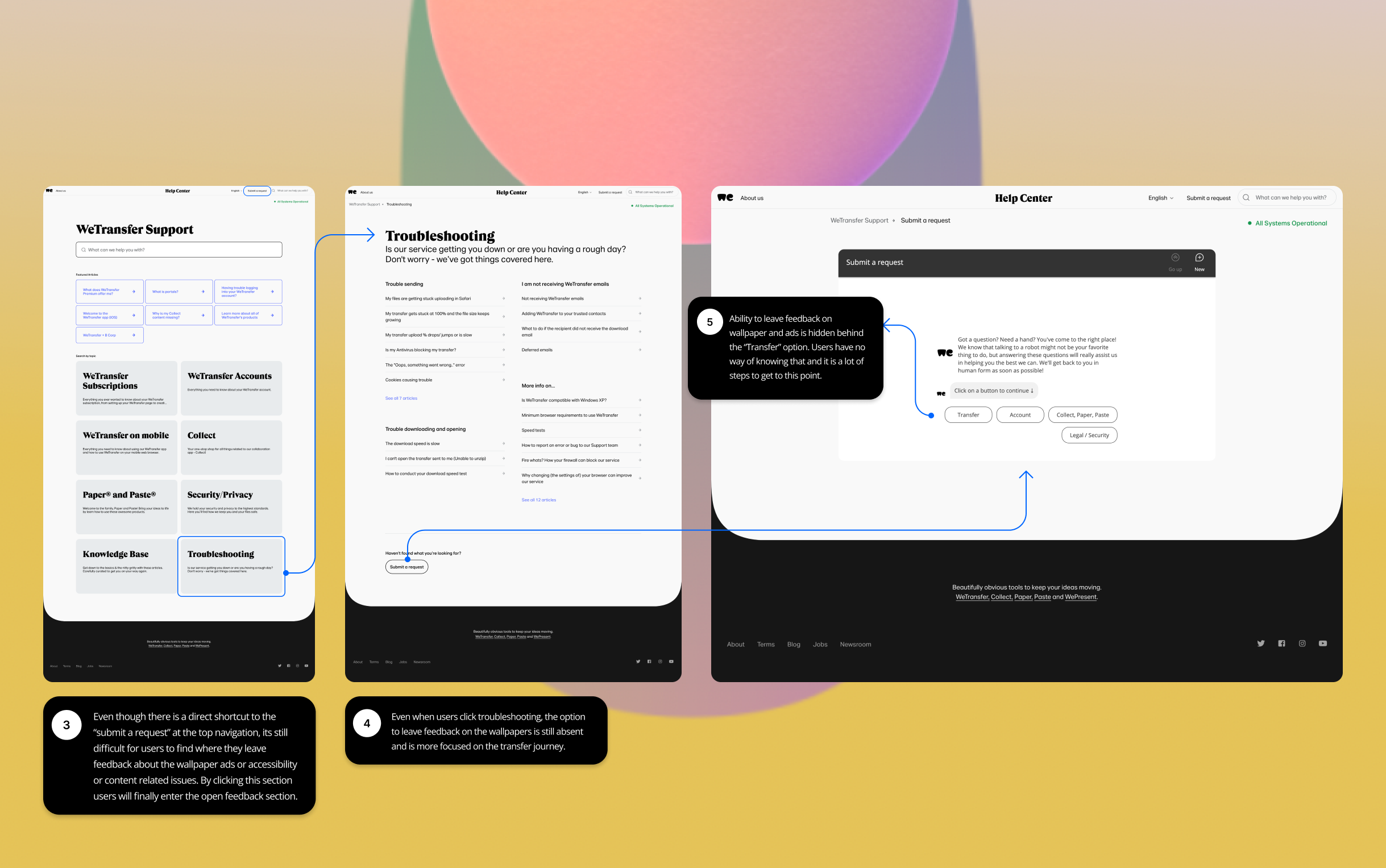
Users often didn’t know where to leave their feedback for Ads and wallpapers specifically. A lot of the feedback that users left via our ticket system got lost layers deep, or ended up in the wrong buckets (e.g. for upload/download feedback.) with a higher risk of being ignored.
”I try to report my issue on their website but the robot doesn’t have the right buttons and when you get all the way to end of one bottom line it’s a ridiculous effort to try and communicate your own issue.”
💬
From organic feedback we learned that users responded with a mixed sentiment towards some campaigns.
Through customer support we did discover there were a lot of issues around motion, accessibility with motion sensitivity coming back multiple times. CTR and quantitative data is not sufficient enough pinpoint how users feel, therefore we learned it was needed to add attitudinal metrics to get a broader picture of how users experienced the campaigns and potentially discover more accessibility issues.
”The tool is useful but the art and messages it shoves in your face every two minutes is unnecessary and forced.”
Too many steps before landing at the ad/wallpaper feedback section in old flow.
Next was an audit of our current support flow to check what are the barriers of completing and submitting a ticket specifically for topics not related to transfers. Very soon we realised that it was difficult to leave direct feedback and the user had to go through many steps to eventually get to the correct section.


First steps in creating the feedback tool
We started with a kick-off to discuss, questions, constraints and HMWs
HMW questions:
Problem 1: Users often don’t know where to leave their feedback on content.
HMW: How might we support users to efficiently leave feedback on content and ads specifically?
Problem 2: Users find it difficult to understand where to leave feedback.
HMW: How might we make the organic feedback process more quick and intuitive?
Problem 3: We don’t track user sentiment.
HMW: How might we create a process to track user sentiment more efficiently?
The constraints:
Sales was concerned this feature would drive away attention from the ad possibly decreasing CTR.
We needed permission from clients to gather data on their content.
We didn’t have any tools in place yet that easily measured user feedback.
Streamlining data, and attaching a database could take time.
Technical questions:
How can we link the feedback to a specific wallpaper so we know which feedback belongs to which wallpaper?
Where are we going to store the collected feedback?
How do we combine this with the rotation mechanism of the ads?
Which data tool do we use to create a clean data stream so that we can derive categories from the analysed data?
Requirements:
The system must have a clear user-interface.
The system must not interfere with the process of downloading/uploading files.
The system must not interfere with the user experience of the ad.
The system must allow users to give feedback via an input form.
The system must redirect to a data base where it stores the incoming data and feedback.
Hypothesis:
If we simplifying the process to leave feedback, then more users will submit feedback.
Success Metrics:
Customer Satisfaction Score (CSAT)
Customer Effort Score (CES)
Task-Completion-Time
Customer Support Ticket Trends
Click Through Rate
5-10% Increase in response rate feedback form

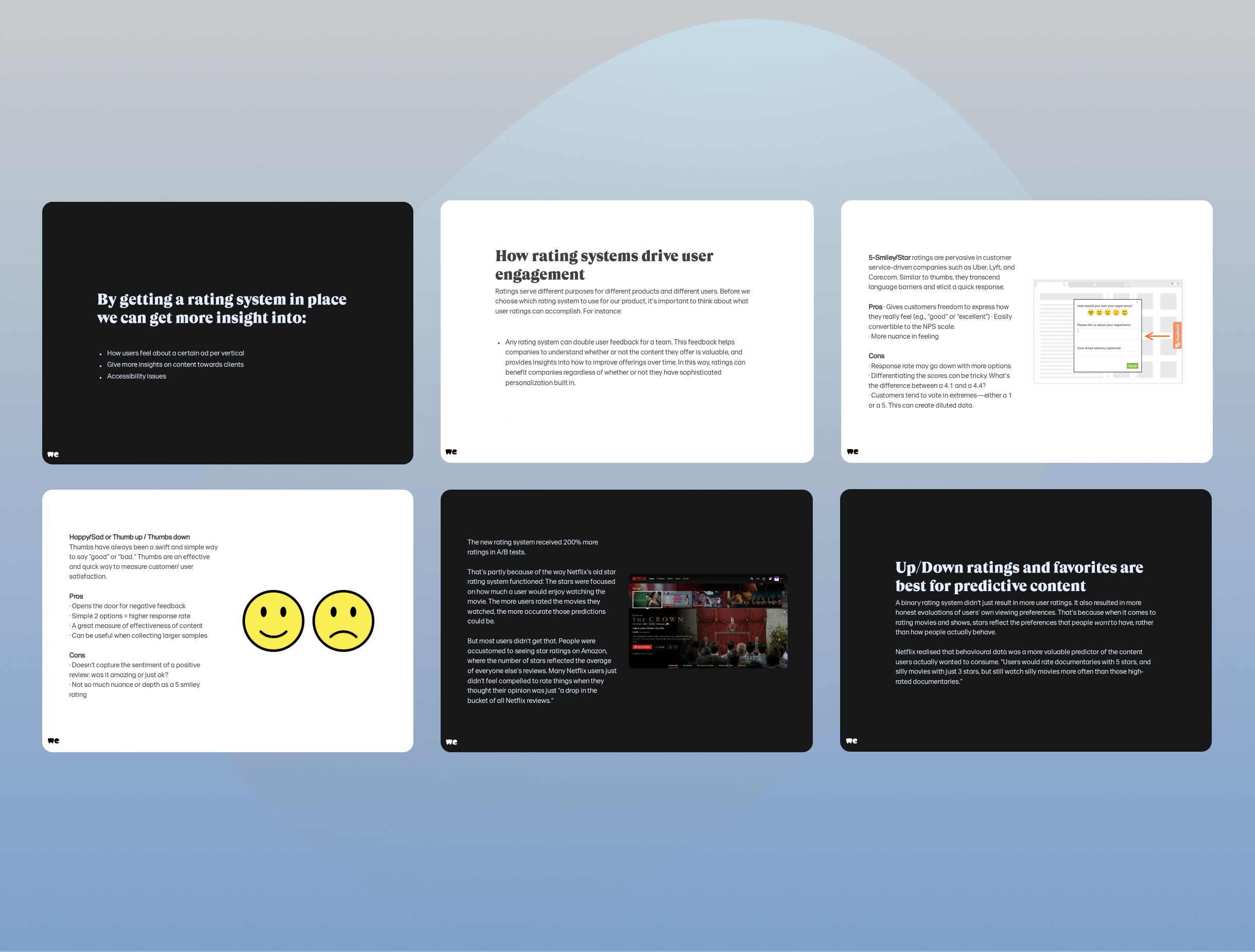
Exploring different types of rating systems.
We started with some benchmarks on various user feedback widgets and we did a deepdive into type of rating systems to determine which system is most relevant to our platform to get the most out of the feedback and weigh out the pro’s and con’s.

Fun exploration and design exercise with the designers
I prepared a jam session for a small group of designers to already ideate on this while engineering was giving thought at the processes in the backend. In this phase we explored different ways in which users could leave their feedback on the wallpaper and served as an inspiration session.
We brainstormed about a few questions, before we went into our collaborative ideation session.
How can we make the UI as minimally invasive as possible but still stand out?
How can we use the right wording so it will be easy to interpret for users?
How do we want the interaction to be between steps and screens?
How many steps do we want the user to go through?
How can we make it playful and give it that WeTransfer look and feel?
What would be the best positioning considering there are client logo’s and cookie banners?

Design exercise on CSAT surveys
Shifting our approach to integration with conversational AI
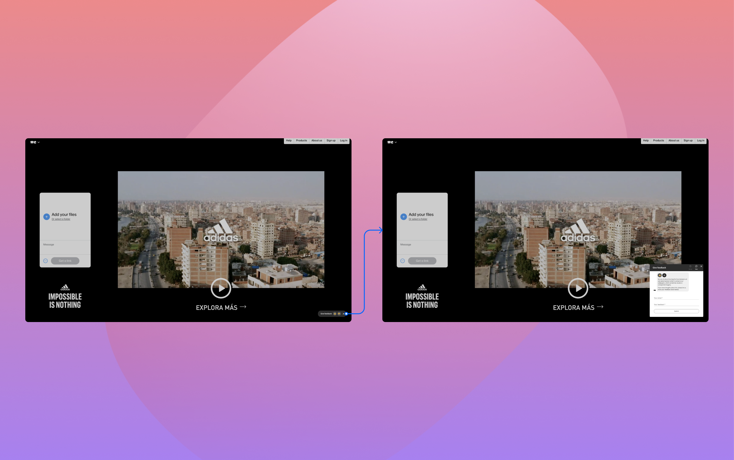
Redirect from our chatbot to zendesk
After speaking with our engineers, we learned building a feedback system from scratch with our own database would be a lot of development effort. In order to still capture attitudinal metrics, we saw an opportunity to integrating the feedback tool with our existing chatbot and set up a flow there instead. This would lower the risk of building an MVP with a lot of engineering effort and would be a great first step to measure how much feedback would come in.
Redirecting the data
To improve our bucket structure would provide a good first step to gain insight into how users feel about our wallpapers ads. The data would be redirected so Customer Support would have an inbox specifically for ads and wouldn’t get lost this way.
Redesign of conversational flow
I started with improving the conversational flow and sat together with the chatbot specialists to define these new buckets based on earlier research data.

Entry point via Help & Support center
Improved conversational flow and better defined buckets to cluster incoming data.
In this improved conversational flow Ad/Wallpaper feedback option is not hidden behind “Transfer” anymore but has its very own prominent place. This offers users the ability to leave feedback specific to the wallpaper ads regarding motion, accessibility or brand sentiment. In addition we added the option to leave more general feedback if the buckets/topics weren’t sufficient enough.
By analysing user feedback we identified a few categories that stood out. We used these to create new buckets, making it easier to cluster the incoming data. This way we had much more specific feedback and data landing in the right buckets that related to the wallpaper ads instead of in the “transfer” buckets. For the rotating ad we decided to keep the interaction simple and directed towards the content to keep the option for open feedback and let it run for a few months to see it matches the already existing buckets.

Submit a ticket proposal

Rating a wallpaper proposal
Next steps
Next steps were too get more specific on the type of feedback we want to collect. For the first phase we collect general feedback. The next phase is about doing sentiment analysis and synthesis on the new incoming feedback and learn to understand not only why they like or dislike the content, but also understand why by asking more specific questions so we know what to improve as people not always disclose this in open feedback.
Parallel to that we ran more generic surveys asking how users feel about the brands WeTransfer collaborates with to learn more about their brand preferences and familiarity.

Learnings & Key takeaways

Users are willing to help and collaborate more than you think.
When talking to customer support and a few users I learned how eager users are to leave their feedback. I learned so much by speaking to customer support and some users during interviews which inspired me a lot!

Creatively make use of what is available, yet challenge what is needed to improve.
It is important to be flexible in these kind of trajectories and being able to adapt if needed. By making use of what was available regarding tooling, we found a way to still collect feedback before we would jump a new MVP or third party tool that a lot of time and effort to implement. This way we can improve over time by closely measuring sentiment and even build a case add additional tooling.

Building bridges between cross-functional teams is key for success.
In the end it is one holistic journey to the end user. To the user it is one product. An obtrusive advertisement might influence their overall experience regarding transfers and vice versa. This project has taught me a lot about the importance of building bridges between teams.
Results
By introducing more UX metrics we can track sentiment overtime gaining more understanding of our free user target audience. Something that is important to measure if we want to learn what kind of effect ads have on conversion and brand attitude.
1. Accessibility trajectory
We set up an accessibility trajectory and audit with a third party (nomensa) to improve our wallpapers and reduce friction.
2. Introduction of attitudinal metrics
This project was the first step in gathering more data on sentiment regarding content, transfers and ads with the goal of optimising the user experience.
3. Improved conversational flow
By collaborating with the support team directly we came up with a proposal and solution to gather more direct feedback in two different ways. Directly via the wallpaper and via an improved flow for submitting a ticket regarding the ads and content, and not just transfers.